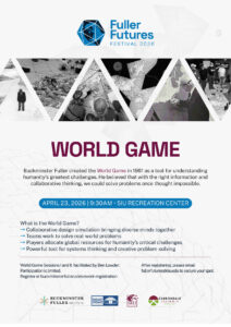
One of the greatest criticisms of Bucky’s earliest inventions, including his Dymaxion car and house, was that he was creating solutions for problems that did not exist – it is clear Bucky was decades ahead of his time. His third major invention, the Dymaxion map, proved to be a little more useful to masses of those times. This map was Bucky’s attempt to improve upon some of the inherent problems with other map projections that try to represent a three–dimensional globe onto a flat two–dimensional plane, such preserving landmass shape and area. While professional cartographers drew select criticisms to its design, it is clear the Dymaxion map boasts distinct advantages over other projection designs. For example, anthropologists appreciate its layout because it clearly illustrates how our landmasses are connected, which makes it easier to visualize past human migrations. The projection is also useful to political geographers, thanks to how it better preserves landmass shape and area.
Figure 1. The original Dymaxion map article in Life magazine.
The map was first released as an insert in the March 1st, 1943 issue of Life magazine. It was originally designed as a cuboctahedron. This geometry ultimately proved to be problematic, so, in 1954, Bucky enlisted the help of architect partner, Shoji Sadao, and they revised the map into the icosahedron design seen today. The main theme of the Dymaxion map was average minimum annual temperature, although it is unclear where Bucky gathered the data. This data has not been updated since Bucky originally developed the map.
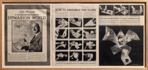
A goal of the 2026 Fuller Futures Festival was to relaunch Bucky’s World Peace Game – a task that necessitated the creation of a new World Game playing map. The Fuller Dome Home Museum enlisted the help of Dr. Justin Schoof, a professor in the Geography program in SIU’s School of Earth Systems and Geography and Michael Edidem, a PhD candidate in the Environmental Resources and Policy program, along with Corey Tester of SIUC’s School of Art and Design. It was decided that this new game map should include updated climate data to better reflect our modern world climate. The updated data, mean annual near surface air temperatures over land and sea-surface temperatures over water from 1991 – 2020, were derived from the ERA-5 reanalysis project (Hersbach et al. 2020). Dr. Schoof then gave this data to Edidem who applied it to a dymaxion projection template using GIS. Tester then used Edidem’s image to digitally illustrate the new map using vector technology that permits infinite scaling without any loss of image resolution. The final game map measures over 24×50 feet, and it is beautiful!
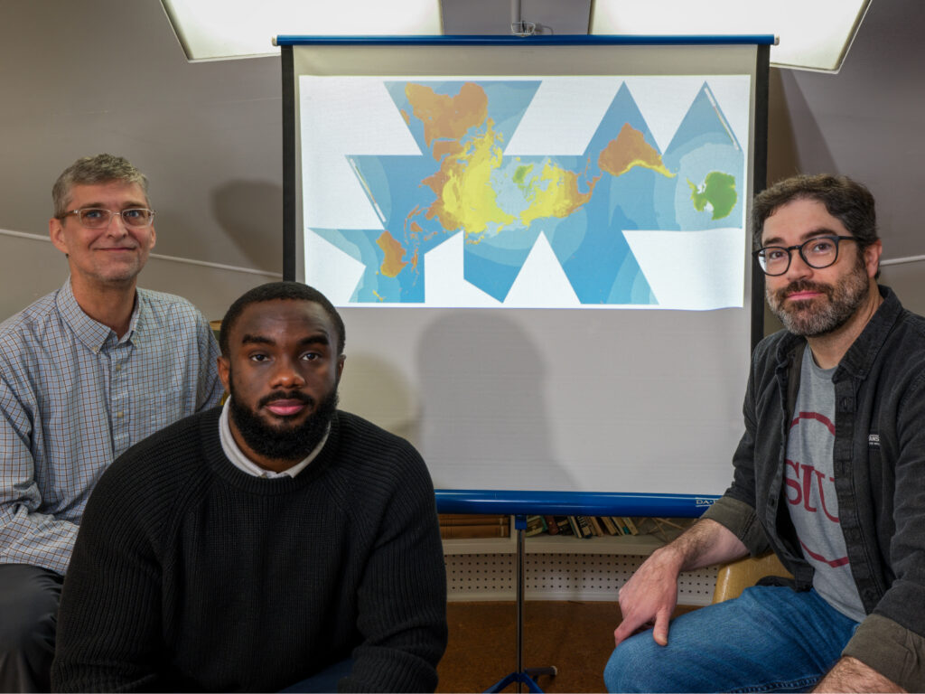
Figure 2. From the left: Dr. Justin Schoof, Michael Edidem, and Corey Tester with the updated map projection.
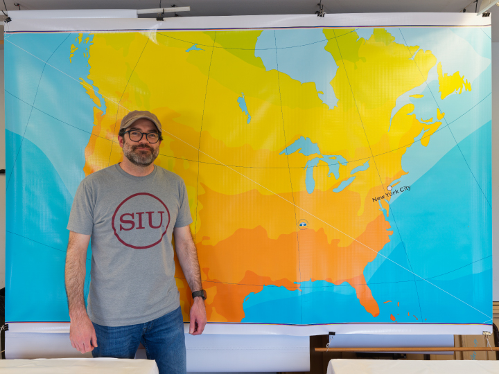
Figure 3. Tester with one of the printed vinyl panels of the game map.
This new climate data is the first major scientific update to the Dymaxion map in decades, and we are proud to share our revised edition with the world.
The map was printed with both portability and durability in mind, and the Fuller Dome home is excited for its inclusion in the relaunch of Bucky’s World Peace Game. One of the future goals of the museum is to host our World Game around the country, with the hope of inspiring youth to realize that world equality is only achievable through cooperation.
This map was created through a partnership between the Fuller Dome Home Museum, the Buckminster Fuller Institute, and Southern Illinois University Carbondale, and it was printed with the permission of the Buckminster Fuller Estate.
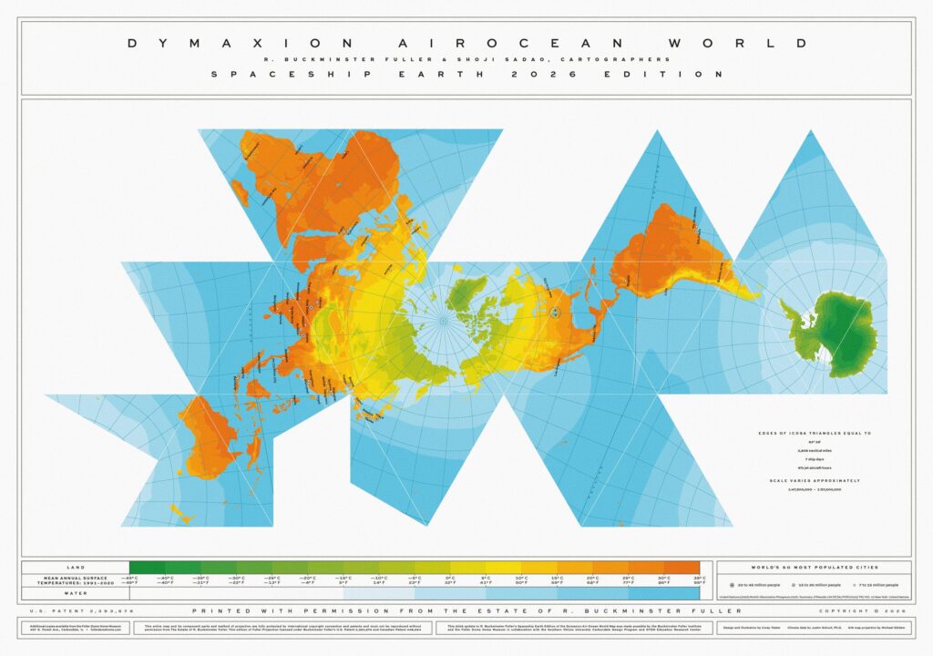
Figure 4. The 2026 edition of the Dymaxion map.
Sources:
Hersbach H (and co-authors) (2020). The ERA5 global reanalysis. Quarterly Journal of the Royal Meteorological Society, 146, 1999-2049.
https://www.genekeyes.com/FULLER/BF-2-1943.html
https://en.wikipedia.org/wiki/Dymaxion_map
Buckminster Fuller, Sadao, and Zung Architects.
-Mike Chervinko